Showing posts with label 1948. Show all posts

Thursday, 13 April 2017

Saarland 1948 - Airmail stamps

Nearly 250 km long, the Saar River meanders through the breathtaking countryside of France and Germany. Travelling along this river one would expect to see stunning forest landscapes, canals, old bridges, and the occasional village. The Saar River also boasts.the UNESCO World Heritage Site Völklinger Hütte, and the famous Saar Loop at Mettlach. Over time the river has played a vital role for industry in Saarland, being used to ship raw materials for the coal, iron and steel industries. And the fertile banks of the Saar were perfect for wine growing, which continued up till the early 20th Century. For more on Saarland check out THIS blog post. 

***

On 1 April 1948 a set of three airmail stamps were issued for Saarland (Saar Protectorate). One design was used for all three values. The designer was Albert Decaris. René Cottet engraved the design. It is a stunning design, featuring the silhouette of a plane flying over the Saar River.


***

I love this design, and while studying it I grew curious as to what type of plane the silhouette might be representing. The main problem I faced was, does the silhouette accurately represent the plane it is supposed to be depicting? And for that matter is it an actual plane being represented? Assuming the silhouette is accurate, and that the plane has two engines, one on each wing, I didn't have much luck finding a match. But if we perhaps extend artistic license a bit and go with the possibility of the plane having two engines per wing, then I may have found a possible match. The plane could possibly be a SNCASE SE.161 Languedoc. 


As I say, this is merely a possibility. I have found no definitive evidence either way. If anyone out there can shed any light on what type of plane the silhouette might represent, I'd love to hear from you.

Until next time...


Thursday, 2 March 2017

I Muse...on a Scandal in Saarland

Autumn has arrived Down Under. So what better way to welcome a new season than a bit of a scandal...

The year was 1948. French stamp engraver Albert Decaris had submitted several designs for a new Saarland definitive series. The designs were accepted, three of which featured the faces of Saarland workers. But little did the French Postal Authorities know, these designs were based on photographs Decaris had seen and used without gaining permission from the original photographer, Ilse Steinhoff. Apparently, a long legal battle ensued.

After the stamps had been issued, the people who had had their photos taken saw themselves on stamps, and naturally they were quite shocked! Subsequently, an article was published in ILLUS magazine  revealing the faces the stamp images belonged to. As a collector I found seeing the original photos quite cool.

***

The 2f and 3f stamps depict a miner named Josef Holz from Hasborn at the harvest.


***

The 4f and 5f values depict Josef Holz's daughter, Alina. She is also busily harvesting.


***

The 6f and 9f values depict Josef Holz standing proudly at the entrance of a mine. Incidentally, this image was used on the cover of ILLUS magazine.


***

While searching for information on these stamps I also came across one of Decaris' sketch's for Holz standing before the mine.


In case you are interested this article can be found in ILLUS 1948 No.3 - "The Living Stamp". If anyone knows where a copy of this issue can be purchased, please let me know. I'd love to have a copy of it for my collection.

Until next time...


Saturday, 4 June 2016

I Study...Some Printing Techniques

I have previously written two blogs studying the printing issues surrounding the France 1948 reissues of the 1946 Luxembourg Palace issue, designed and engraved by Albert Decaris. I think I have finally grasped the processes involved in creating the reissues, thanks to the help of a reader of the blog. Thanks Florian.

Okay, let's try to finally put the printing issues faced with the 1948 reissues to bed. I previously discussed the basic principles of intaglio printing, so I won't go into it all again. Click HERE for the blog. What I will do is elaborate on that process, which, I hope will finally explain why the 1948 Luxembourg reissues look different to the original issue in 1946. It has to do with the process required to create an altered reissue.

Here is a brief summary of what happens...to the best of my knowledge. A transfer roller or 'relief' roller is created from the master die. This 'relief' roller then has the alterations made to it. The raised or 'relief' portions that need to be changed are removed from the roller. Then this 'relief' roller is hardened, and used to create a secondary master die. It is on this secondary master die that the new values are created (by an in-house engraver). Then a transfer roller with the new value is created. It is these processes on top of further use by the transfer roller to the printing plate which can, over time, round the edges of the sharp lines of the engraving, having the effect of blurring the image somewhat. 

Also, as I stated in a previous blog (you can find the link above), the ink choice for the 15f stamp contributed to the blurring effect. The consistency of the red ink was quite thick and therefore more difficult to wipe away any excess, which ended up on the paper, effectively blotting the image.

I am the first to admit that I am the farthest thing removed from a printing expert as there ever can be, but I am slowly learning all the lingo etc... I do hope my rambling narrative of this process has not been too tiresome for you. As I said in the 'About Me' page, the purpose of the blog is to chronicle my learning journey, so I'm bound to get things wrong at times. But that's the fun of a hobby in my eyes.

Until next time...

Stay Decaris Crazy!

Thursday, 26 May 2016

I Study...Printing Issues

In my last blog on 12 May I discussed some of the differences between the France 1946 10f Luxembourg stamp, issued on 29 July, and the 1948 12f and 15f reissues issued on 10 May and 10 December respectively. In that blog I suggested the possibility that the reissued values may have been different engravings. Now, I have to say, I did struggle with this idea. Why go to the trouble of re-engraving an entire stamp? And also, a fact that was pointed out in a very good blog by a former French printer (click HERE for the blog), no engraver, no matter how skilled, could replicate the exact same lines in a stamp. Such an endeavour would take even longer than the normally time-consuming and laborious job of engraving a unique design. Why go to all the fuss?

Why indeed! Well, it turns out France's postal authority didn't go to all that fuss. Either the original master die engraved by Albert Decaris or the transfer roller (not sure which) was altered in order to update the values.

So why then did I even entertain the notion of a re-engraved stamp? Well, firstly, as I pointed out in my last blog, it wasn't only the values that were changed. RF was changed to France. The position of Postes is different. And the shading lines along the top have been, naturally, altered to accommodate the changes.

Another bit of information regarding the above changes that I have found out since my last blog is the probability that Albert Decaris did not engrave the changes. These were, in all likelihood, executed in-house.

***

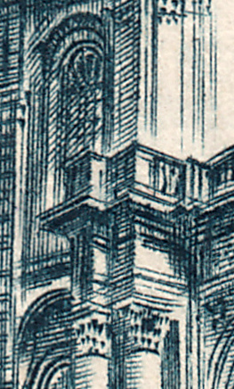
The changes to the upper area of the reissues was not the only reason I considered the possibility that they were re-engraved. When I studied the 10f stamp against the 12f and 15f stamps I discovered many small differences that caused me to consider the possibility of an all new engraving. But the answer as to why there were so many small differences is quite probably twofold. And the first cause actually contributes to the second cause.

In order to explain the first cause for the subtle changes we need to understand the basic process of transferring an engraving to the printing plate. Basically what happens is the engraver creates an image in reverse on a metal die, which is the same size as the stamp. That die is then hardened. Then a transfer roller is applied to the die and rocked back and forth, impressing the image, now the right way around, onto its surface. The transfer roller is also hardened. 


Now that the image is fixed into the transfer roller it can be transferred to the printing plate. This is done in a similar way to the master die/transfer roller exchange. The transfer roller is applied to the printing plate over and over, depending on how many stamps are required per sheet. In the case of the Luxembourg Issue there were fifty stamps per sheet. So the transfer roller was applied to the plate fifty times.


***

Okay, now that we've discussed the process of plate production we can examine where the changes to the actual stamps start to occur. As I said earlier, in order for the printing plate to be created the transfer roller needed to be literally pushed into the metal of the plate some fifty times, and that is just for the first plate of the first issue (I have no idea how many plates were made for this issue). So we can naturally assume that the transfer roller developed a certain amount of wear and tear over time. This wear and tear would appear on stamps as blurry, less crisp lines within the image. This is exactly what we see in the re-issues.

The second cause of the changes was the colour choice for the re-issues. Two shades of red were used for the re-issues. According to Y&T the 12f was red-carmine and the 15f was plain old red. Red is notorious for having the effect of blurring images. Then when we add the fact that the lines on the plating plate were themselves starting to blur...well, we have our answer!

To conclude my rambling, the Luxembourg Issues were not re-engraved. The subtle changes in the stamps are due to wear and tear on the printing plates and the colour choice of the stamps.

Until next time...

Stay Decaris Crazy!

Friday, 13 May 2016

I Study...The Luxembourg Palace Issues

Yesterday I received a comment on one of my blog posts regarding the Luxembourg Palace issues designed and engraved by Albert Decaris. The reader asked me to add an image of the 10f value to my 1948 reissues blog so he could compare the different values against each other (click HERE). I was happy to help him out, and I have to admit that even though I did a blog for the 10f and a separate blog for the reissues, I never thought to compare the different printings. I just assumed they were from the same die with simply a value change. 

So I took out my 10f 1946 stamp and my 12 and 15f 1948 stamps and laid them out side by side. I was immediately surprised at three glaring differences that are so obvious I can't believe I had missed them! I guess sometimes you don't see what's right in front of you. And the more I looked the more differences I found. This got me to thinking: are the reissues totally different engravings?

***

Below is the top portion of the 10f and 15f together for comparison. I have circled the three main differences. Note that the 12f is the same as the 15f so there was no need to add it here.


The biggest difference is the name, which in turn, contributes to the other two changes. The original 10f value has only the initials "RF", whereas the 15f value has the full name "France". This change completely alters the shading at the top middle and the top right corner to the point where in the corner it is non-existent in the reissue.

***

I found some more differences between the original and the reissues. But are these differences due to engraving variances or are they merely a result of colour choice? Both the 1948 reissue stamps were printed in red, which make the image look rather heavy, blotting out some fine details. I have again circled some of the differences in fine detail that I found between the issues. 


Firstly, if we compare the detail I have highlighted within the rectangle of the 10f stamp with the two other values, there is a distinct difference in the clarity of detail. The red seems to have obscured the background somewhat. So I ask again: is this an engraving difference or merely a  colour difference? Not sure? Take a look at the pot on the 10f value. The outline is far better than the reissues. The same goes for the signature; the 10f is by far the clearest of the three. And if you look closely you will notice that the "I' is not dotted in the original 10f, but it is dotted in the reissues. 

These are but a select few of the numerous differences I have found all over the stamps. In fact, as I write this blog with the comparison image staring me in the face I just noticed that the shading on the top left border area is also different. I could go on and on, but I think I've rambled enough for this blog. Perhaps another blog at a later date looking at a few more differences...

To conclude, I initially believed that the reissues of this stamp were from the same die with the value changed, but all the differences suggests to me they were different engravings. I could be totally wrong here, so if anyone has any additional information on the printing of these issues I'd love to hear from you.

Until next time...

Stay Decaris Crazy!

Thursday, 31 March 2016

Saarland 1948 - More Definitives

In a previous blog I studied the four stamps Albert Decaris designed and engraved for the 1948 Saarland definitive set of 13. This set was issued 1 April. For my quick run-down on the territory of Saarland, click HERE. Decaris designed all thirteen stamps in this set. As mentioned above four of these he engraved, the other nine of which he only designed. These nine stamps can be further broken down into four unique designs, each with its own engraver.

***

The first design depicts clasped hands. The theme of reconstruction after the ravages of WWII runs through this entire set. This particular design suggests co-operation in the reconstruction process. The design was issued in three values. This design was engraved by Dufresne.


***

The second design type depicts a worker. This man has a big smile on his face, suggesting happiness in his work. This design was used for two values. This design was engraved by Piel.


***

The third design type depicts a young woman gathering wheat. This design was used for two values. I can't quite make out the engraver's name on these stamps...


***

The fourth design type depicts a miner in a hard hat, ready to descend into the bowels of the earth. This design was also used for two values. This design was engraved by Cottet.


***

Until next time...

Stay Decaris Crazy!

Sunday, 20 March 2016

Saarland 1948 - Definitives

A couple of weeks ago I was doing some work on my Decaris stamp database when I came across a set of thirteen stamps issued in 1948 that he worked on for Saarland that I didn't have listed. I immediately went searching for a copy of these stamps. When it comes to engraved stamps I usually opt for mint stamps, purely so the whole image can be seen without being covered in any way by a postmark. I quickly found that I was going to have to compromise when it came to these stamps. Mint copes are rather expensive, so I expanded my search to used stamps. After a bit of looking I found a decent used set for a reasonable price.

***

Now I'll have to admit that until I found the listing for these Saarland definitives I hadn't even heard of Saarland. So I did a bit of research. What I found was quite interesting... 

The region of Saarland did not exist until 1920, and at that time it was called The Territory of the Saar Basin. It was created as a result of a regulation of the Treaty of Versailles after World War I. The territory was governed by the United Kingdom and France from 1920 to 1935. The territory was located in the southwest of Germany. It included parts of Prussia and parts of Bavaria (see the map below). Its capital was Saarbrucken. In 1935 a referendum was held and the inhabitants of the territory voted to rejoin Germany. 


In 1947 after WWII the Saar territory was once again taken from German control, and this time placed under the sole control of France. It was called the Saar Protectorate. The Saar Protectorate remained under French control until 1 January 1957 when it was incorporated into the Federal Republic of Germany.

During the two periods mentioned above the Saar territory had its own currency, the Saar franc, and its own postage stamps.

***

On 1 April 1948 Saarland issued a set of 13 definitive stamps. Albert Decaris designed all thirteen stamps, four of which he engraved. In order to prevent this blog from being too long, I will only study the four stamps Decaris designed and engraved. In a future blog I'll study the nine other stamps in this set which he designed but did not engrave With that said, let's get to it...

The 10f dark blue...


This stamp depicts a colliery shaft head. A colliery is a coal mine and all the buildings associated with running the mine. The shaft head is the business end of a coal mining shaft. It contains the relevant mechanics to extract coal from the mine. 

***

The 14f dark violet...


This stamp depicts smelting. Smelting is a practise whereby a base metal, such as silver, iron, copper etc., is extracted from its ore by heat and a reducing agent. The reducing agent is usually a type of carbon such as coke or charcoal, which in the heating process removes the oxygen from the ore leaving behind the elemental metal. Of course, this is just a basic summary. The actual process is just a tad more scientific, which is rather beyond the needs of this humble blog.

***

The 20f henna brown...


This stamp depicts reconstruction. Presumably the reconstruction Decaris has illustrated is of buildings damaged or destroyed during World War II. If anyone out there has any further info on this stamp and what it depicts, I'd love to hear from you.

***

The 50f blue black


The detail in this stamp is exquisite...


This stamp depicts the Mettlach Abbey Portal. Also known as the Old Abbey, this striking building was once a Benedictine cloister. Construction of the Abbey began in 1727 and it was completed some time in the second half of that century. But it was destined not to be an abbey for long. The monks fled the abbey in 1792 after the French Revolutionary Army penetrated the Saar. In 1802 the French declared the abbey a building of the state as a part of their move to secularize the nation. In 1809 the building was sold to Villeroy & Boch paper manufacturers. Below is an image of this amazing piece of architecture...


Until next time...

Stay Decaris Crazy!

Saturday, 19 March 2016

France 1948 - Luxembourg Palace Reissue

In 1948 France reissued the 1946 Luxembourg Palace stamp, designed and engraved by Albert Decaris. I did a study of the 1946 stamp in a previous blog. Click HERE to check it out.

***

The Luxembourg Palace stamp was reissued in two new values and colours.

The 12f value was issued on 10 May and it was printed in red carmine (Yvert colours)


***

The 15f value was issued on 10 December and it was printed in red. (Yvert colours)


***

The original 1946 issue.


Until next time...

Stay Decaris Crazy!